The impact of banners on your website
- Read time: 3 mins
- Tech level: low
- Key point: minor website adjustments can combat banner blindness.
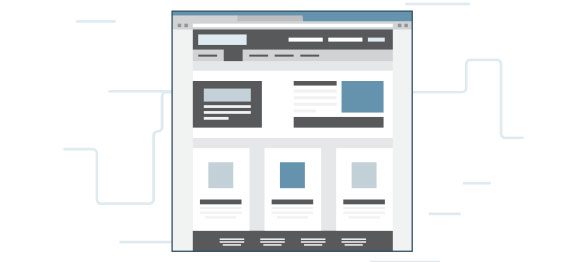
- ‘Above the fold’ or clever use of web-page real estate: When using a website to reach a goal or complete a task, users have been found to read and examine content that is in the top half of the page, or ‘above the fold’, with much more interest. So, by placing banners on the top of the page or higher than where they were, they will gain more attention and clicks, as well as by being seen without the need for scrolling.
- F-pattern: another study by Jakob Nielson showed that users would initially read horizontally across the top half of the page, and then scroll down. They would then do so again, and finally read the rest of the page on the left-hand side. This process is known as the F-pattern due to the shape it makes, and is common among website visitors. By using this information to our advantage, banners placed across the head of the page, and then anywhere across the site just a small way below, will gain many more responses than in other areas.
- Relevance: One important factor when setting up a banner system on your website is the concept of relevance, and how applicable an advertisement is to your site. By placing banners that have a connection with the site’s information, users will be more likely to respond to those banners because they have more to do with what they are looking for. Google knows this which is why it matches up advertising with keywords it finds in your emails. This can be achieved by having direct contact with the advertiser to gain a better grasp on how suitable their banners will be, and how the user will engage with them.
- Site integration: Many banner designers have taken the unethical route of tricking website users into believing that the banners are part of their website, not the advertisements they really are. This then leads people to believe, through clever design and integration, that some banners are actually just buttons linking them around the pages.
- Dialog boxes: Another popular unethical approach is to use banners disguised as dialog boxes, with fake ‘OK’, ‘Cancel’ and close buttons that are actually part of the banners themselves, and by ‘closing’ a supposed dialog box, website visitors will actually be linked to the advertiser’s page.
- Homepage skins: One popular approach, if conducted well, can be aesthetically pleasing and avoid banner blindness. It involves making the ‘skin’ of a page, or everything not including the main body of content being replaced with a large image, mainly visible on the sides of the page and hard for the eye to avoid. Users can then click on these to be linked to the advertiser’s website.
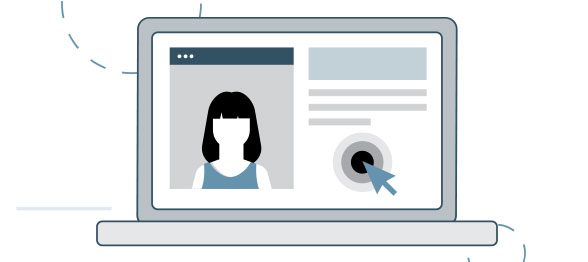
- Face recognition: Through another of Nielson’s studies, website visitors were shown with an outstanding rate to pay more attention to faces within advertisements, with their eye being drawn to them nearly all of the time. This is especially the case if the face appears to be looking directly at the website visitor, as opposed to looking away from them. Again, by using this information you can implement banners with faces so they get more recognition by site visitors, as seen in the heat map below that tracked eye movement. However, using stock photos is never a good idea, and photos of real people always garner more trust and credibility.
Banners. They make the webpage world go round, providing the money needed to many website owners to keep them up and running. However, countless studies have concluded that our banners are not getting the attention they need, and it can all trace back to banner blindness. So what is banner blindness? And how can you work around it to make your site the most user-friendly it can be, while still bringing in more clicks?
What is banner blindness?
Banner blindness is a term used to describe a type of website visitor behaviour. It’s when site visitors don’t pay attention to anything that is, or even looks remotely like, an advertisement. Coined by Jakob Nielson in 1997, it’s mainly due to website visitors being very goal driven. Web visitors try to avoid being distracted from what they are looking for and upon entering a site–they will either be scanning a page quickly, leaving just as fast as they entered, or they will read it with more depth and interest for longer before exiting.
Either way, eye mapping tests have proven that visitors focus on the text and information provided, or what they actually came to the site for, not the banners surrounding it. Thus a problem arises for you, the website owner: how can I get my users to notice and then interact with my banners?
How to work around banner blindness
To avoid the issue of banner blindness, such banners need to use certain advertising strategies so that they gain the attention they need. Some strategies include:

How people have worked around the issue
Unethical examples
Ethical examples
And so, in conclusion, banner blindness is a very real issue for the online world. It can take away valuable conversions, and if not addressed, will have a serious impact on your site and user engagement. But through some minor adjustments to your sites design, you can avoid this issue altogether and make your site more user friendly to get further clicks from visitors.